Case Study: San Francisco Interior Designer + Architect Collaboration
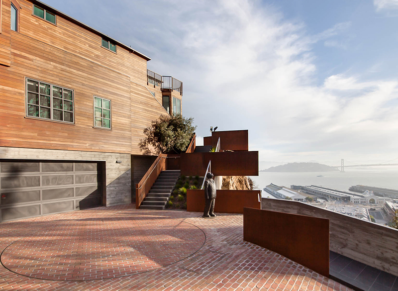
I couldn’t be more excited to share my interview with one of our favorite San Francisco architects (and personal friends), Caroline Nassif of Studio Ovo. When we first started working together 10 years ago I was immediately drawn to her collaborative, kind spirit and technical expertise. We collaborated on a ground up project in Telegraph Hill while she was still at Lundberg Design. Niche Interiors ensured that the interior design and furniture worked seamlessly with the architectural design and finishes that Caroline and the Lundberg team selected. This 8,000 square foot modern home perched on the edge of San Francisco’s Telegraph Hill earned praise from our clients and also captured the cover of Luxe Magazine in 2016.
NICHE INTERIORS: You worked as an architect at Lundberg Design in high-end residential design for over 10 years before launching your own firm Studio Ovo in 2021. What are some of the philosophies that you are bringing into your own practice from Lundberg? What is your mission statement and core values at Studio Ovo?
STUDIO OVO: During my decade-long apprenticeship at Lundberg Design, led by my friend and mentor Olle Lundberg, I had the great privilege of working alongside a crew of incredibly talented designers and fabricators. Olle had bought an old mattress warehouse in the 80s that housed not only his apartment and the architectural office, but also our own massive in-house metal and wood shop—a rarity to say the least. This unique setup made working at Lundberg feel like a laboratory for experimentation, where bold, creative ideas could come to life and attention to detail and craft was a visible constant practice. As a team, we were focused on designing spaces that were highly personal, tailored to the specific needs of each client, and deeply connected to the integrity of natural materials. One of Olle’s driving philosophies was a profound respect for the beauty of natural materials like steel, wood, glass, and stone, which were allowed to age and patina gracefully. This wasn’t just about aesthetics—it was almost a spiritual belief in the honesty and majesty of the materials themselves. We sought to design structures and spaces that were durable, easy to maintain, and timeless in their authenticity. These philosophies of material integrity, personalization, and bold experimentation are now central to my own practice.
At Studio Ovo, authenticity is at the core of our mission. We prioritize integrity in all aspects of our work, from our relationships with clients to the execution of their unique visions. We believe in the raw beauty of natural materials and celebrate the way they evolve over time. We embrace modern design that is warm, tactile, experiential, and non-toxic. Our design practice is inclusive, approachable, and always centered on creating spaces that are both stunning and functional. We are passionate about making the process of designing and building easy, enjoyable, and deeply personal for each client, ensuring that the end result feels genuinely theirs.
NI: This San Francisco home that we worked on together was one of our most successful collaborations with an architect, the entire home felt very seamless and integrated. From your perspective as the project architect, why do you think this was the case? Are there certain conditions that make a collaboration between architect and interior designer successful?
I agree! It was one of my favorite experiences working with an Interior Designer as well. Our clients invited you to join the design team fairly late into the project – I believe we were in the middle of Construction Documents, which meant that the architectural design was fairly set in place. While this might have posed a challenge for some interior designers, the Niche team embraced it as an opportunity to dive deeply into the design documents and understand exactly what the clients valued. One of the things that made the project so successful was how in-tune your team was with not only the client’s desires but the vision we had for the architecture. Your curiosity and easy, open communication allowed you to integrate quickly, and the result was not only stunning but deeply cherished by our clients.
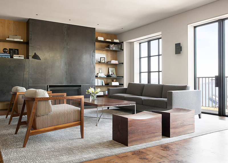
NI: I love how the restrained material palette of oak, steel and basalt create a sense of warmth in this modern home. Could you tell us about the design development process and your inspiration for the materials in this home?
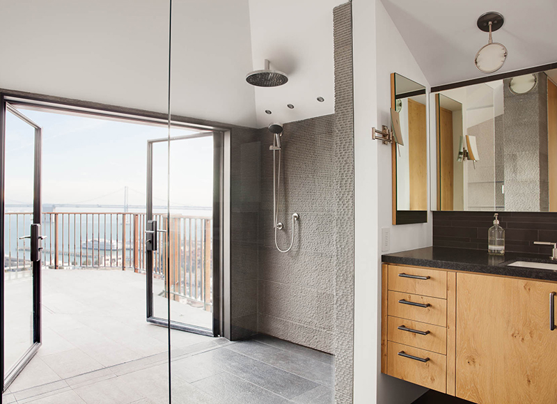
With most projects, we often have to help the clients through an editing process, where we embrace our best ideas and discard ones that will be less successful. This editing process is particularly important when it comes to material choices. We are careful to not throw every idea we have into a project but to go through a rigorous critique so that we can ensure that the end result is a thoughtful harmonious whole. This client, in particular, was an exception. They knew from the beginning that they wanted to use only one stone, one species of wood, and one finish for steel throughout the house, and our job was to create subtle variations on that limited palette. This was such an exciting opportunity for us! For example, while oak was the only wood we used, we chose a cerused oak for the casework and doors and a custom end-grain oak floor. Similarly, we used a textured brushed natural finish for the basalt stone tile for both the exterior and the interior of the home, but we used a super wavy flamed finish for some interior bathrooms and a honed smooth mosaic version for others. The end result is a strong statement with pops of unexpected textural delight.
NI: Maximizing the ceiling height, even by an inch, was a major directive from the client. How do you approach volume in a space? Is there a rule of thumb or calculation you use to make a room feel expansive without feeling cavernous?
As a general rule, we love volume! It’s often hard to gain ceiling height in a dense urban environment like San Francisco. For this particular project, we were renovating a house built in 1910 with low ceilings, and this challenge was compounded by the fact that we had to retain much of the existing historic structure. We had no fear of creating a space that was too cavernous; instead we were fighting for every fraction of an inch we could get. This forced us to be efficient with all the stuff that usually goes into a floor plate – mechanical ducts, plumbing pipes, electrical conduit, etc. To add to the complexity of the design, every floor plate in the house was supported by a different structural system because some floors remained as is and others were reconstructed. As you can imagine, our job is almost like a 3D tetris puzzle.
One of the things that sets us apart from other architectural practices is that we always design in 3D using advanced software. We essentially build the house digitally before it is built on site. Our digital models readily allow you to see the space at eye level and create walk-throughs through the building. This not only allows our clients to preview how a room will feel, but it also allows us to perform the complex coordination necessary to avoid conflicts during construction. We model all the beams and the ducts in our computer model to make sure everything fits, avoiding costly change orders and problems down the line. The added bonus is that renderings are super easy, and we can readily export our models to VR headsets that allow our clients to experience the space well before it’s built. So, to answer your question: our general rule of thumb for testing out proportions of a room is to put a human in the space!
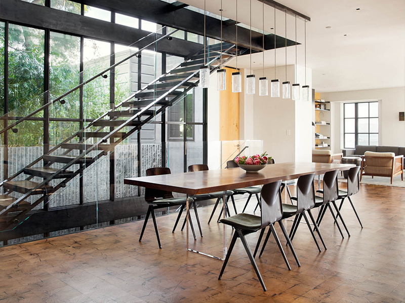
NI: The stair design won multiple design awards – Congrats! How did this iteration come about?
The stair design incorporated our clients’ wishes, namely the following:
- Visual connection was key. They wanted to be able to see through the stair structure in both the short and the long directions, so that the stairs did not act as a visual barrier to the fully glazed wall along the long edge or in the new axis of circulation connecting the house from end to end
- The clients didn’t want the stair to feel too springy. They wanted it to have minimal deflection when they walked up and down, so that it felt sturdy and strong
- The clients wanted the stair to spatially connect the 4 levels of the home, so you could look up and sense the overall height of the house
- Paying close attention to how sound traveled throughout the house was a key priority
This set of desires drove the design. First, we experimented with the stringer structure playing with folded tube steel and other ideas until our brilliant Structural Engineer, Kristen Steiner, at GFDS Engineers, came up with the truss concept that allows you to be able to see through the stair in all directions. Her idea was to create trusses on each side of the stair that act as skeletal stringers, so that the stair treads could float, welded between them. The composition of each tread had to be carefully coordinated with the fabricators to conceal all mechanical fasteners within each tread while the exterior remained clean and seamless. We beefed up the steel thickness for the stringers and paid careful attention to the attachment at each floor level to make sure the stair had minimal bounce, and we pulled back the guardrails at each landing to allow visual continuity to all four levels of the house. Finally, to deal with the sound transfer issue, we added black acoustic material to the bottom of each tread and covered it with slatted wood panels to dampen sound transfer between levels.
NI: The end grain oak floor tiles were a labor of love. Tell me more about where you sourced the wood and how they were fabricated?
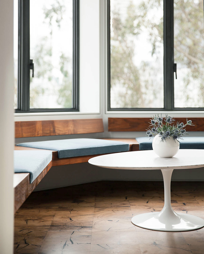
While the clients and I were touring First, Last, and Always in San Francisco’s Dogpatch neighborhood, we noticed a striking floor that looked like a checkerboard composed of end-grain wood tiles. End-grain wood is lumber that is cut not along the long edge of the wood, but in cross sections revealing the concentric rings of the tree. This creates an extra durable floor resistant to stains and scratches because the exposed wood fibers are much more dense – you see this often in wood cutting boards. Our clients fell in love, and we adapted this idea for the house. Our millworker sourced reclaimed beams from old barns in the midwest that they sliced into ¼” thick tiles that were then laminated to create individual engineered tiles that didn’t warp or cup, and they filled any holes with a black resin to create dimensionally stable pieces. Each tile had a tongue and groove edge that allowed them to be laid out seamlessly on the floor. The final composition was sanded and sealed. This floor may very well last forever.
NI: Are there any sustainable elements to this home, either in the design or materials used?
The house is bursting with sustainable features. From PV panels on the roof to recirculating radiant heating in the floors to triple paned glass windows that block solar radiation. Zero VOC paints were used throughout and we utlilized reclaimed wood as we mentioned previously. Every effort was made to create a home that would not only be friendly to the earth but would be cherished by its occupants for decades to come (and save the clients money by saving energy).
NI: Now that you have a fabulous new San Francisco studio space, what’s next for Studio Ovo? What are you working on now and what is on your bucket list for future projects?
At Studio Ovo, we’ve been on quite the journey since starting our practice three years ago. We’re eagerly awaiting the completion of our first project—a stunning home in Potrero Hill for a dear friend and client. This project has been a labor of love, filled with whimsical details and exceptional craftsmanship. We’re thrilled to be collaborating with such a talented team to bring this vision to life. Currently, we’re also exploring some exciting new opportunities. We’re working on a potential restaurant for our friends at a local brewery, which has us buzzing with anticipation. Additionally, we’re in the early stages of designing a unique bookstore in Martinez for a client with a vibrant theater background. On top of that, we’ve completed several renovations for venture capital offices, allowing us to flex our design skills in different contexts.
Looking ahead, we’re passionate about continuing to create deeply personal architecture for our residential clients in the San Francisco Bay Area and throughout California. However, we also value the dynamism of commercial and restaurant projects, which offer a refreshing change of pace amid the longer timelines of residential work. On our bucket list, we dream of larger-scale projects that push our creative boundaries, as well as exploring new styles and locations that inspire us. You can follow Studio Ovo on Instagram or check out their website here.
