
Harnessing the Power of Color in Your Home
In the realm of interior design, color isn’t just a visual element; it’s a powerful tool that can influence our emotions, behaviors, and perceptions. Each hue carries its own unique psychological associations, making color selection a crucial aspect of designing spaces that evoke specific feelings and responses. In this post we’ll delve into the fascinating world of color psychology, focusing on four specific hues: blue, green, yellow, and red. From the calming serenity of blue to the vibrant energy of red, our San Francisco interior designers explore the diverse effects these colors can have on interior spaces and the individuals who inhabit them.
Understanding Color Psychology
Color psychology is the study of how colors affect human behavior and emotions. It delves into the psychological, biological, and cultural factors that influence our perceptions of different hues. Each color carries its own unique psychological associations, which can vary widely depending on factors such as personal experiences, cultural background, and societal norms.
Warm vs. Cool Colors. Colors can be broadly categorized into warm and cool tones. Warm colors like red, orange, and yellow are often associated with energy, passion, and warmth, while cool colors like blue, green, and purple evoke feelings of calmness, serenity, and tranquility.
Psychological Associations. Different colors evoke specific psychological associations. For example, red is often associated with excitement, passion, and intensity, while blue is linked to calmness, trust, and stability. Understanding these associations is crucial for creating harmonious and balanced interior spaces.
Cultural Influences. Cultural factors play a significant role in color perception. For instance, white is associated with purity and innocence in Western cultures, while it symbolizes mourning in some Eastern cultures. Interior designers must consider the cultural context of their clients when selecting colors for interior spaces.
Blue: Calm + Serene
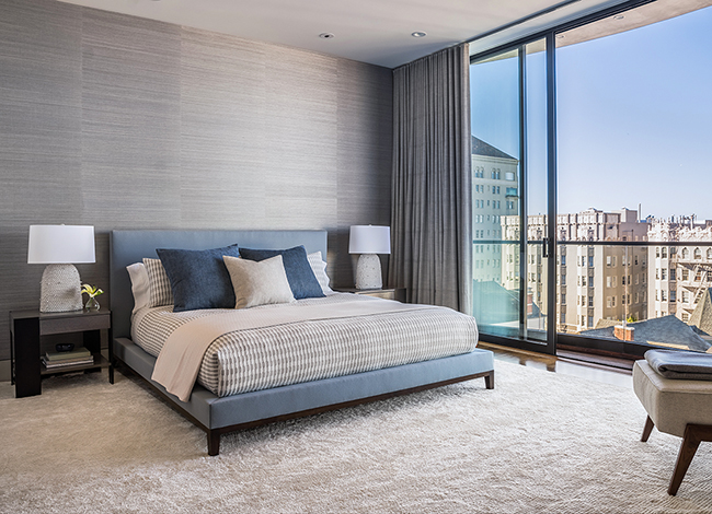
Blue is often hailed as the color of serenity and tranquility, evoking images of vast oceans and clear skies. Its calming effect can promote relaxation and a sense of peace, making it an ideal choice for spaces intended for rest and rejuvenation. In bedrooms, bathrooms, and meditation areas, shades of blue can create a serene atmosphere conducive to unwinding and stress relief. Additionally, blue is associated with trust and reliability, making it suitable for professional settings such as offices and conference rooms where a sense of stability and confidence is desired. Our interior design team loves combining shades of blue with greys and neutrals in bedrooms to create a calm space for relaxation, as shown in this primary bedroom we designed in San Francisco’s Pacific Heights neighborhood.
While blue can be a versatile and calming color in many contexts, it is not the best choice for kitchens due to several factors. Blue has been shown in some studies to suppress appetite. This effect is likely due to the fact that blue is not a color commonly found in natural foods, leading to a subconscious association between blue and unappetizing or spoiled food. In a kitchen, where the goal is to create a space that encourages cooking and dining, using colors that stimulate appetite, such as warm tones like red, orange, or yellow, may be more conducive to creating an inviting atmosphere. Lighting also plays a crucial role in how colors are perceived in a space. In kitchens, where bright task lighting is essential for cooking and food preparation, the color blue can appear dull or even grayish under certain lighting conditions. This can detract from the overall visual appeal of the space and make it feel less vibrant and energetic. Opting for warmer colors that are more flattering under artificial lighting can help create a more visually appealing kitchen environment.
Green: Nature + Harmony
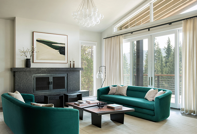
Green is intrinsically linked to nature, symbolizing growth, renewal, and harmony. Its association with lush landscapes and foliage makes it inherently calming and rejuvenating, making it an excellent choice for bringing a touch of the outdoors indoors. In interior design, green can be used to create spaces that feel fresh, invigorating, and balanced. From vibrant emerald accents to subtle sage tones, green can be incorporated into various elements of a room to evoke a sense of harmony and connection with nature. Green is particularly well-suited for living areas, kitchens, and study spaces where a calming and revitalizing atmosphere is desired. Our interior designers selected an emerald green velvet for the sofas in this living room to connect the lush views of the surrounding mountains with the interior spaces.
While green is generally a versatile and harmonious color that can work well in many different rooms it isn’t the best choice for rooms with low light. Green hues may appear dull or muddy in rooms with limited natural light or poor artificial lighting, especially darker shades of green. Without adequate lighting to enhance its vibrancy, green can make the space feel drab and uninspiring. In such cases, it’s better to opt for lighter shades of green or choose a different color altogether to brighten up the room and create a more welcoming atmosphere.
Yellow: The Cheerful Optimist
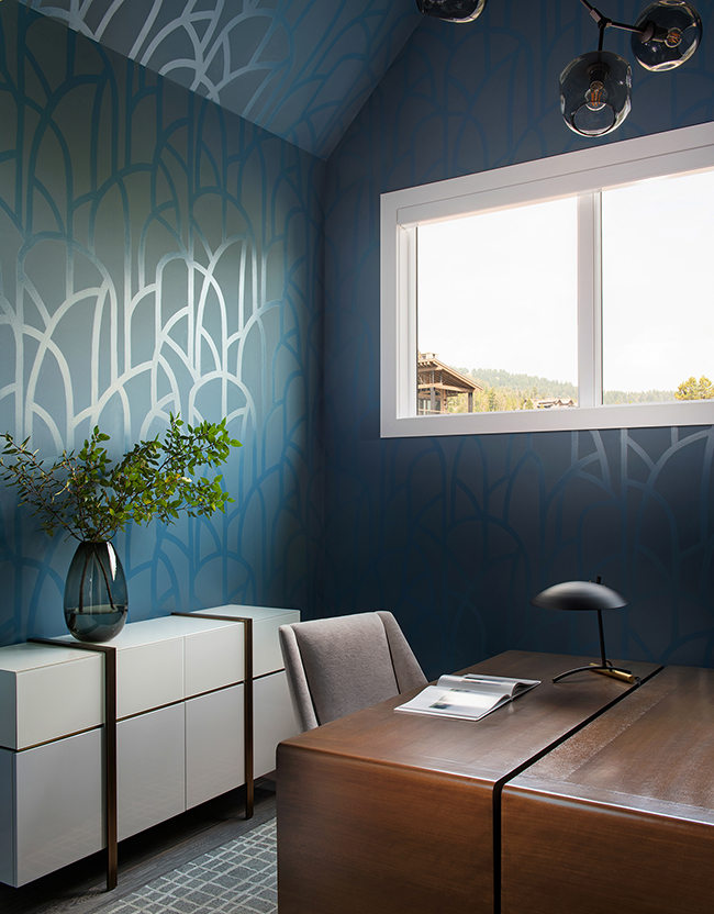
Yellow is the color of sunshine, radiating warmth, energy, and optimism. Its vibrant and uplifting qualities make it an excellent choice for infusing spaces with a sense of joy and positivity. In interior design, yellow can be used strategically to create focal points, brighten dark areas, and evoke feelings of happiness and vitality. Whether used as an accent color or as the main palette, shades of yellow can add a cheerful and welcoming touch to any room. In kitchens, dining areas, and social spaces, yellow can stimulate conversation and foster a sense of conviviality and warmth. Since this color can be intense and attention-grabbing, it’s best to use in smaller doses as we did in our San Francisco remodel below.
Red: Bold Energy
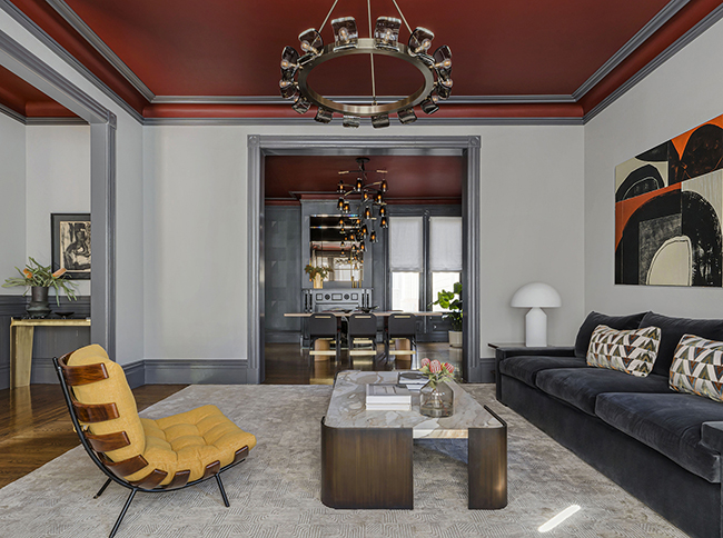
Red is a color of intense passion, energy, and excitement. Its bold and vibrant nature commands attention and evokes a range of emotions, from love and desire to power and determination. In interior design, red can be used to create dramatic focal points, inject energy into spaces, and stimulate the senses. Whether used sparingly as an accent or boldly as a dominant hue, shades of red can add warmth, depth, and personality to any room. In dining areas, entertainment spaces, and creative studios, red can inspire creativity, encourage social interaction, and create a sense of dynamism. Our interior designers chose an oxblood red hue for the ceilings in this San Francisco Bachelor Pad to add vibrancy and to create a sultry vibe for our client who loves to entertain.
While red is a bold color that can add energy to a space, there are certain rooms where it may not be the best choice due to its strong psychological and physiological effects. Here are a few rooms where the color red might be less suitable.
Bedrooms: Red is known to be a stimulating color that increases heart rate and blood pressure. In a room intended for relaxation and sleep, such as the bedroom, these physiological effects may not be conducive to a restful environment. Additionally, red is associated with passion and intensity, which may not promote a sense of calmness and tranquility conducive to sleep. For bedrooms, it’s generally better to opt for softer, more soothing colors like blues, greens, or neutrals to create a serene atmosphere.
Children’s Rooms: While red can be playful and energetic, it may also be too intense for children’s rooms, especially for young children who may be particularly sensitive to strong colors. Red’s stimulating effects may lead to overstimulation and hyperactivity, making it challenging for children to wind down and relax in their bedrooms. Instead, consider using softer, more playful colors like yellows, greens, or soft neutrals that create a cheerful and inviting atmosphere without overwhelming the senses.
Relaxation Areas: Rooms dedicated to relaxation and unwinding, such as meditation rooms, yoga studios, or spa-like bathrooms, may not be the best fit for the color red. Red’s energizing and stimulating properties may be at odds with the goal of promoting relaxation and stress relief in these spaces. Instead, opt for calming colors like blues, greens, or soft neutrals that evoke a sense of serenity and tranquility, enhancing the overall relaxation experience.
By understanding the psychological effects of color and using them thoughtfully, interior designers can craft environments that not only reflect the tastes and preferences of their clients but also enhance their well-being, productivity, and overall quality of life. For more color inspiration check out more of our San Francisco Bay Area interior design projects.