Cohesive Color Palettes
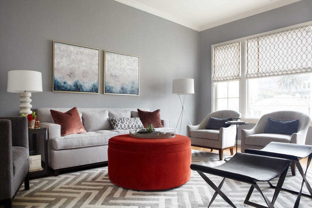
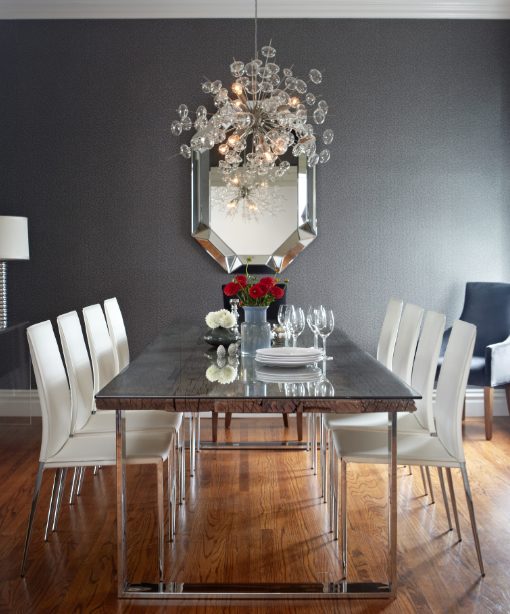
Our team of Bay Area interior designers just completed another home in Pacific Heights – we celebrated with a long (but fun!) photo shoot. This San Francisco home is the perfect example of how a cohesive color palette works; the rooms all speak to one another without the home feeling matchy.

Create a color palette before starting your project. Figure out what mood you want your space to convey. Are you drawn to more contrast or less? Do you like a little drama or do you tend to play it safe? Start with a base of neutrals and a few accent colors and go from there.
Rooms that connect to each other should tell a similar color story. In the dining and living rooms above we took the living room palette of lighter greys and turned it up a notch in the dining room for a more dramatic effect. Going with lighter or darker tones in the same color family is a good rule of thumb.
Use bold color intentionally and sparingly. Saturated, bold color is best used in small doses: on occasional pieces, accent pillows, and artwork. The walls in small transition spaces such as an entryways or powder rooms are also perfect for bold hues. Use various tones of the same color throughout a space to tie it all together.


I hope we see more photos. Congrats!
Your room designs are fabulous. Particularly your concept of starting with a base of neutrals and a few accent colors inspire us for our own work and lighting picks that complements sophisticated interior design settings.
I love the colors. Also the accessories and open feeling in the home. Great choices of color. Now all they need are a luxury car in the garage a well bread feline and the lifestyle will be complete. Thanks for the tips.